


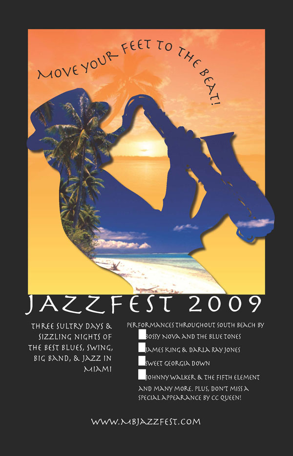
Magazine Ad
Making the poster for the Jazz Festival was relatively easy with the directions from the book. I chose to keep it simple and to the point by keeping it as close to the example as possible. I feel that the one in the book did a great job of displaying the images and making it look clean cut and organized. The colors on it are very vivid, especially when you use the black. The orange and the blues tend to pop giving it something extra flare. The alignment and proximity are very important as well because you don’t want to make a poster for something and not have it be legible to the audience you are hoping to target. Something to always think about when you are designing an advertisement is how you are going to capture the eye of your audience. While making this poster, I tried to keep the font simple and I spaced it so that the letters were not pushed too much together and the lines were far enough apart that you could still read it. It is important when designing a poster to know what audience you are targeting. In this case, I decided that it was a more middle aged, modern audience therefore I made the poster clear, but added a little something to it with the font that I chose. I feel like the font that I chose made it more modern than using an outdated or over used font like Times New Roman. I have never made a magazine ad like this before but it was very helpful to follow the book and have the design tips already there.